|
|
|
||||||||||||||||||||||
|
|
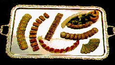
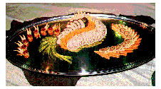
Line and balance are important, but to be effective they must relate to the overall continuity of the plate or platter. For example, if you have a platter with several strong lines working against one another, you've created a presentation that is uncomfortable to look at. For that reason, overall layout is important. Layout must take the following points into consideration: · What do you want the guest to see first? These are important questions to answer because they dictate the focal point of the platter. You must establish a focal point before the principles of balance and line can be applied. For example, if I were to lay out a poultry platter, I would want the breast meat, being the most expensive part of the platter, to be the focus of attention.
Next, I would use line and layout to design a presentation that would draw the guest's eye to the part of the platter. All lines would rotate back to the centerpiece, the focus of attention. By using this manner of presentation, you are able to guide the guest's eyes to the area you want them to see first.
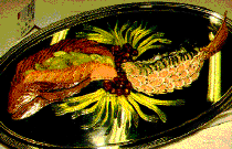
Food-U and professionals haves adopted the philosophy that the layout should be natural in line and shape and should help tell the guest something about the platter. In other words, the layout should let the guest know what the platter's theme and contents are . An example of this philosophy is Franz Popperal's salmon platter prepared in Frankfurt. The layout gives one strong line, causing attention to focus on a natural and functional shape - the shape of a salmon. The other layout elements are also at work on this platter: The food has an enhanced three dimensional look, as well as a look of action or motion. These factors add excitement to the platter. Natural shapes, as discussed in balance, offer another dimension to the plate or platter layout. The whole platter becomes a centerpiece, with no need for a sculpture or sign behind to get the message across.
|
||||||||||||||||||||||


